

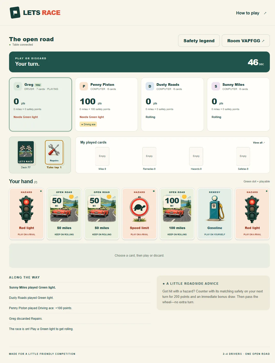
The idea was straightforward. Create a shareable web game inspired by the road-trip card games our group already plays, with two to four players, familiar cards, and the rules we actually wanted to use. It also needed to work on a phone.
We went from that idea to a working ASP.NET Core 10 application, complete with computer opponents, private rooms, illustrated cards, saved games, and automated tests. Getting there involved questions, corrections, screenshots, and one reminder I kept coming back to:
“Should be easy.”
▶ Play Lets Race in your browser
My coding partner was an OpenAI Codex agent. It wrote and edited files, ran builds, executed tests, and helped troubleshoot. We also used its image generation to create the card illustrations.
The game itself does not need a language model to play. Its computer opponents use programmed rules. AI helped us build the software and the artwork, and then got out of the way.
Start with questions, not code
I began by asking for planning and questions before any implementation. That gave us a chance to define what “a game similar to the one we play” actually meant.
The assistant asked how closely the gameplay should follow the original, whether the theme should be a classic road trip, whether players would play live or take turns over time, whether the competition was individual or team based, what should end a game, and whether computer players should fill empty seats.
My answers set the direction: similar gameplay, a classic and fun theme, individual competition, timed turns, and computer opponents.
The ending mattered most. I wanted us to play until the draw pile ran out, then keep going with the cards in hand until nobody had a legal move. No mileage target that ends the game early.
More questions followed. How long should a turn last? What happens if someone runs out of time? Are ties acceptable? We settled on a host-controlled timer defaulting to 60 seconds, a timeout that randomly discards a card, and ties that share the win.
Those conversations turned a broad idea into rules that software could enforce.
The safety cards took the most explaining
I wanted all four safeties with our own scoring: 100 points played normally, or 200 points total when used to counter a matching hazard.
The timing took a few exchanges to get across. A safety counter should happen on the targeted player’s next turn. It should award an immediate bonus draw if cards remain, and then end that turn. The player waits until their following turn to play again.
That single rule changed scoring from mileage alone to mileage plus safety points.
This was the early example of why the follow-up questions mattered. “Include safety cards” would never have communicated our scoring, our timing, and the extra-card rule clearly enough.
Then the technology requirement
Once the rules were settled, I gave one line of technical direction:
“Build in ASP.NET 10 and make it mobile friendly so I can play on my phone.”
The result uses ASP.NET Core 10 and C# on the server, with HTML, CSS, and JavaScript in the browser.
The server owns the game: whose turn it is, which moves are legal, when the timer expires, what cards remain, and how scores change. Each player receives only their own hand plus the public information needed to follow the race. That split is what keeps opponents from seeing cards they should not.
We added private room codes, invitation links, computer opponents, reconnection support, and saved game state.
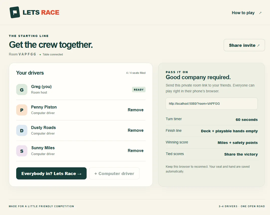
There was an ordinary development problem along the way. Windows blocked the compiled application from running inside the initial installation folder, and moving the project into its own development folder fixed it. AI-assisted development still involves environment issues, file permissions, and application restarts.
Playing it is what found the real problems
Once the game ran, my feedback got much more specific.
I wanted discarded cards in a visible discard pile. The server was already recording them correctly, but the screen only showed the last discarded card’s name. Technically functional. It did not look or feel like a card table. We changed it to a face-up stack with a count.
Then I asked to see my own played cards. We added separate stacks for mileage, remedies, hazards, and safeties, with a history showing what had been played, including the turn, the safety bonus, and the target of a hazard.
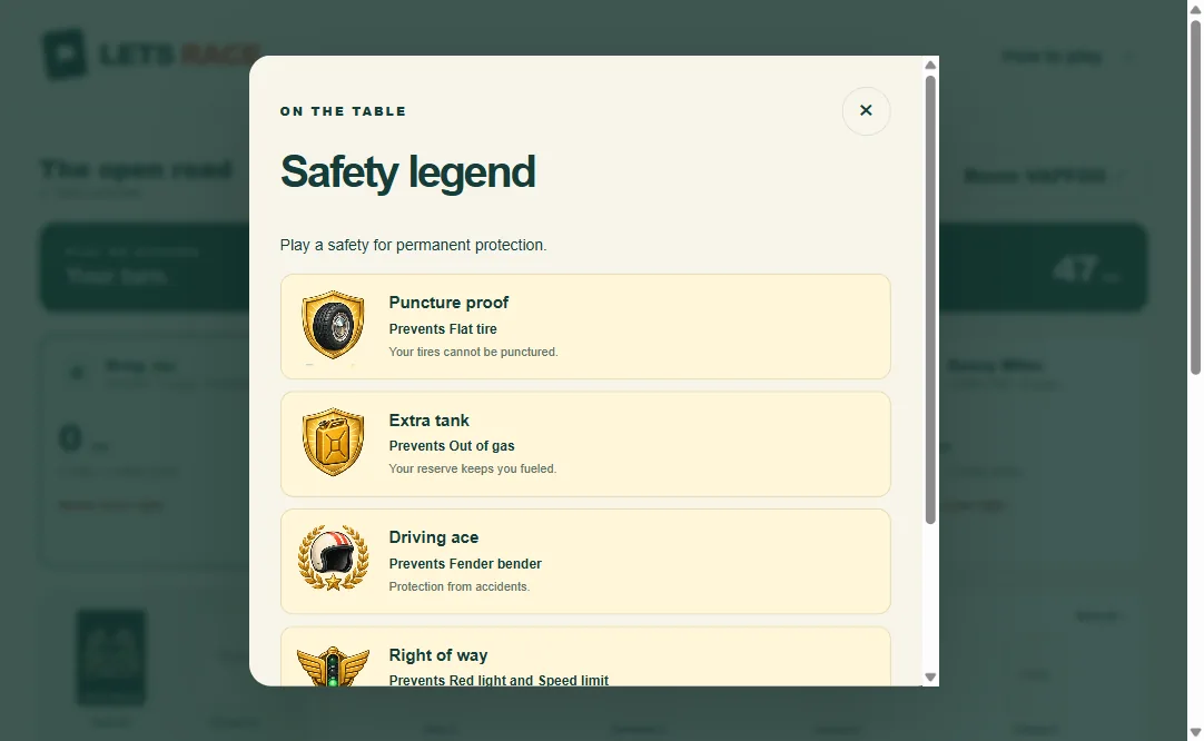
I also wanted a safety legend on screen. Players should not have to memorize which protection stops which hazard.
The artwork needed work too. The first version was simple symbols and text. We generated a coordinated set of 16 retro road-trip illustrations: traffic lights, tires, gasoline cans, repair tools, protective shields, a racing helmet, and a convertible on the open road. They share a consistent style and palette. Card names and mileage values stay ordinary text in the interface, which lets us control their size and readability separately from the pictures.
Mobile took longer than the first build
I did not want to scroll repeatedly to find my hand or the play controls. I asked to hide the extra driver information, the recent-moves list, and the advice panel on phones.
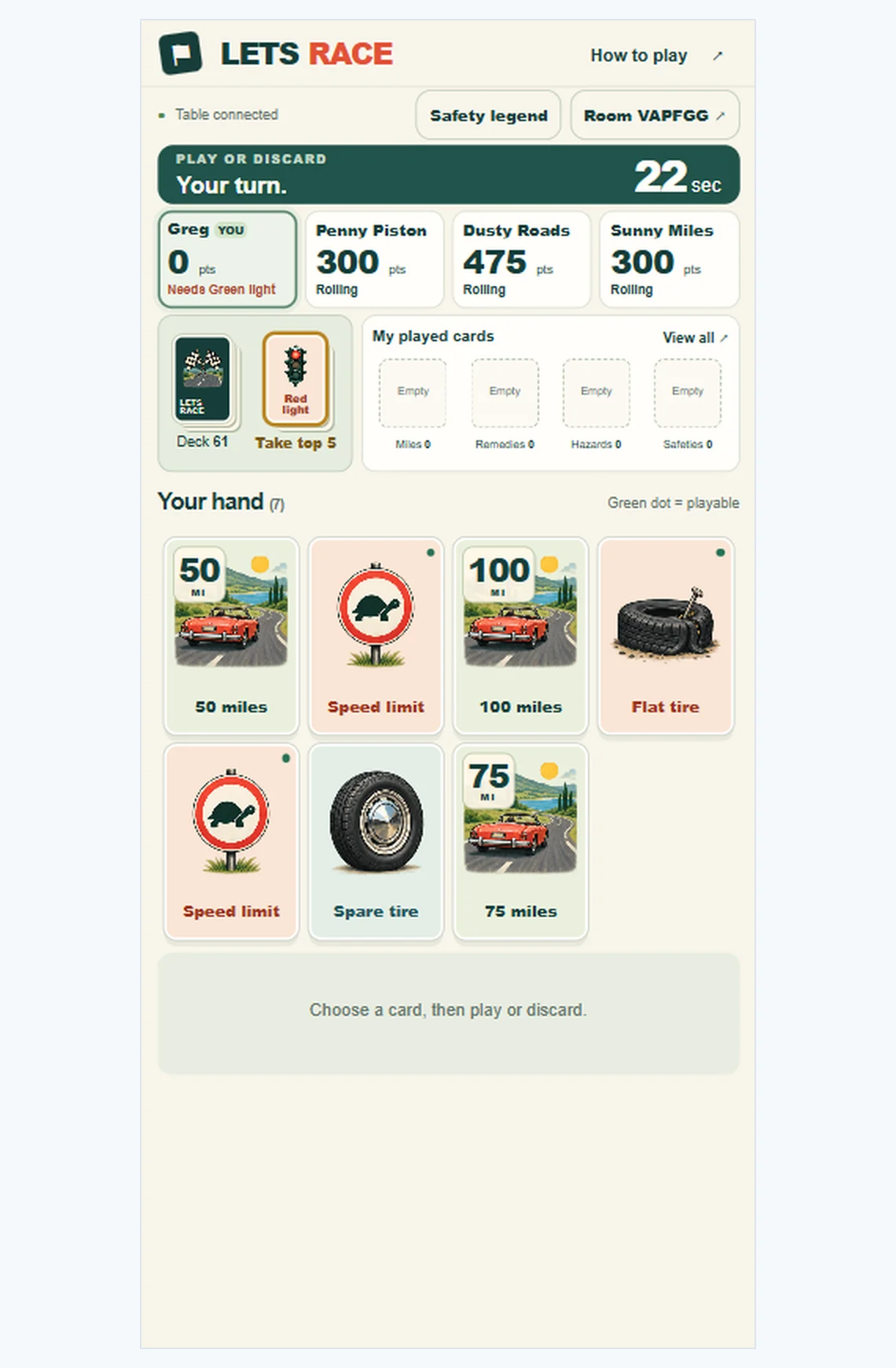
Then the cards started getting cut off. We adjusted the artwork sizing and added hand-page buttons for screens too short to show every card at a useful size.
Another screenshot showed a different problem: large empty gaps above, between, and below the card rows. I marked those spaces directly on the image and asked to tighten the screen. The layout had been allocating tall rows and centering cards inside them. We changed it to pack the cards at a natural height and put the controls immediately beneath the hand.
That marked-up screenshot communicated the problem far better than another general request to “make it mobile friendly.”
The lesson that cost the most time
The biggest interaction lesson came from discard pickup.
I wanted to see which discarded card was available to take. The assistant added a choice at the start of each turn: draw from the deck, or take the top discard.
When I tried it, the extra step felt awkward. I would click a card expecting to play it, and the game wanted me to pick a deck first.
My feedback was direct:
“Click, play or not is fine.”
We restored automatic drawing. A normal turn became: tap a card, then play or discard. Discard pickup stayed, but as an option. Before playing, a player can exchange the automatically drawn card for the top discard. The automatic card returns to the top of the deck, and the exchange never adds a card to the hand.
That is a house rule we adopted specifically to keep the common interaction simple.
What the tests proved, and what they could not
Throughout, the assistant built and ran tests. The final run passed 26 rule scenarios, including 300 complete simulated games across two, three, and four player configurations, plus 22 checks against the running application.
Those checks covered questions like whether someone can act out of turn or submit the same move twice, whether a safety counter scores correctly and ends the turn, whether timeouts put the discarded card in the right pile, whether opponents’ hands stay private, whether played cards and discards remain separate, whether players can reconnect to the same hand, whether optional discard pickup preserves the correct hand size, and whether play ends correctly after the deck is exhausted.
The simulations also confirmed that every card stayed accounted for as it moved between deck, hands, played history, and discard pile.
That is real evidence the rules behave as intended. It is also the boundary of what automated testing does. Every usability problem in this article, the invisible discard pile, the awkward draw choice, the cut-off cards, the empty gaps, passed every test. Playing the game is what found them.
What this actually says about building software
At the two hour mark we had a working multiplayer game, source code, generated artwork, a deployment package, and container configuration. Public hosting was a separate step; the game was running for local-network play.
My role was to explain the rules, make decisions, try the game, and point out what felt confusing. The AI handled most of the implementation, testing, and revision.
Some of the most useful instructions were the shortest ones: show the discard pile, let me see my played cards, explain the safeties, remove the scrolling, tighten those gaps.
And when a new feature made playing feel harder, the direction was simplest of all:
“Should be easy.”
If you want the longer version of this story, we have built a card game and a dungeon crawler the same way. The business version is the same process pointed at custom software and business automation instead of card games.